YouTube Thumbnail Design
Featured Case Studies: YouTube Thumbnail Design
These case studies highlight my skills in creating YouTube thumbnails that grab attention, clearly communicate the message, and increase viewer interest. Each design is made to match the tone, audience, and goal of the video—whether it’s for travel, taste tests, or education.
I focus on using bold text, strong layout, and relevant visuals to make sure each thumbnail stands out in a fast-moving feed. Explore the examples to see how I adapt design choices for different types of content and branding goals.
📌1. Project: YouTube Thumbnail – “The Ultimate Seltzer Taste Test”
🎯 The Problem/Goal
To create a YouTube thumbnail that grabs attention, makes people curious, and encourages them to click on the video.
👩🎨 My Role
I designed the thumbnail from start to finish using Adobe Photoshop. I focused on making it bold, clear, and eye-catching.
✍️ Design Process
-
Researched effective YouTube thumbnail trends in food and beverage content
-
Selected bold typography and a dark backdrop to maximize readability and visual pop
-
Added dramatic lighting, mystery elements (question-mark cans), and water droplets to increase realism and intrigue
-
Iterated on layout and details to ensure clarity and effectiveness on small screens
🌟 Outcome/Impact
-
Delivered a clean, high-contrast thumbnail that grabs attention and encourages clicks
-
Successfully conveyed the “mystery taste test” theme with strong visual appeal
-
Optimized the design for fast recognition on busy YouTube feeds.
Tools Used: Adobe Photoshop

📌 2. Project: YouTube Thumbnail – “Travel Hacks”
🔷 The Problem/Goal
To create a thumbnail for a travel-themed video that instantly communicates value, builds trust, and attracts clicks—ideal for viewers seeking useful travel tips.
👩🎨 My Role
I designed the full thumbnail layout, including image selection, color scheme, composition, and typography to ensure clarity, appeal, and consistency with the video’s content.
✍️ Design Process
-
Researched travel content trends and common visual cues used in thumbnails
-
Combined well-known landmarks (Statue of Liberty, Eiffel Tower) to signal “travel” instantly
-
Used a friendly presenter image to add personality and approachability
-
Designed a split-color background to organize visual elements without clutter
-
Added bold typography to highlight the video’s topic clearly
-
Refined layout for mobile and desktop visibility using Adobe Photoshop
🌟 Outcome/Impact
The final design is a clean, informative, and visually striking thumbnail that quickly communicates the video’s theme. It balances credibility and creativity, improving viewer recognition and encouraging higher engagement.
Tools Used: Adobe Photoshop

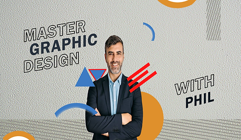
📌3. Project: YouTube Thumbnail – “Master Graphic Design with Phil”
🎯 The Problem/Goal
To create a clean and professional YouTube thumbnail that promotes a graphic design course. The goal was to attract aspiring designers by making the content look trustworthy, modern, and educational.
👩🎨 My Role
I designed the entire thumbnail using Adobe Photoshop. I chose the typography, layout, background, and visual elements to create a balanced and appealing look.
✍️ Design Process
-
Researched YouTube thumbnails for educational and design-related videos
-
Selected a confident presenter image as the main focus
-
Used clean fonts and bold shapes to reflect structure and creativity
-
Added textured background and geometric shapes to enhance visual interest
-
Focused on clarity and balance to ensure the thumbnail looked sharp and polished
🌟 Outcome/Impact
-
Designed a professional-looking thumbnail that clearly represents the course
-
Communicates both creativity and trust
-
Appeals to students and professionals looking to improve their graphic design skills
Tools Used: Adobe Photoshop